

Work / Case study
City Car Parks: one website, two very different visitors
A Plymouth ANPR car park operator in an industry people dread. We researched the market, defined the brand from the bottom up and built a new website that works for two very different people.
Goal: Stand out in an industry drivers dread, and serve drivers and landowners from one website.
- Client
- City Car Parks
- Sector
- Parking / ANPR car park management
- Location
- Plymouth
- Services
- Research & positioning, Brand Building, BrandPack, Website
- Date
- November 2026
- Website
- www.citycarparks.co.uk
The brief
City Car Parks runs fully managed ANPR car parks in Plymouth. Cameras on site, enforcement, admin and appeals all handled, so the landowner doesn't have to think about it.
Here's the challenge. Most people only meet a parking company when they've got a charge. Nobody wakes up hoping to visit one's website. So the brief wasn't "make it look nice". It was: stand out in an industry people dread, and build a website that works for two very different people at once.
Bottom up: research before anything else
Before a single colour was picked, we went back to the foundations. Who is City Car Parks up against, what do drivers and landowners actually need, and what makes CCP genuinely different?
We studied the big national operators. They're built for scale. CCP's edge is the opposite: a small Plymouth team that takes the time to know each site.
✕
What people expect from a parking company
- One set of rules for every site
- A call centre, not a team
- A website built around enforcement
- A fight if you want to appeal
✓
What City Car Parks stands for
- Rules set around how each site actually works
- A small team that knows your car park
- A website built around the person on it
- Clear signs, fair grace periods and a proper appeals process
That research landed on three words that set CCP apart and that every decision since has been tested against:
Brand defined
With the positioning set, we built the brand pack: the strapline, the logo, the type and a palette that feels calm and trustworthy rather than threatening. Clear navy for trust, open sky blue for a lighter touch, steel for structure.
The hard part: two visitors, one website
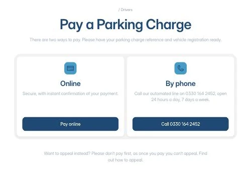
Most of the people landing on citycarparks.co.uk are drivers with a Parking Charge Notice. They're often frustrated, usually on their phone, and they want one thing: to pay or appeal, quickly.
A smaller group matters just as much to the business: landowners deciding who to trust with their car park. They want to see the team, the process and that they'll be treated fairly.
Two audiences, opposite moods. Design only for drivers and you lose the landowners. Lead with the sales pitch and you frustrate the drivers. So we gave each one its own front door.
Who's visiting? Pick one.
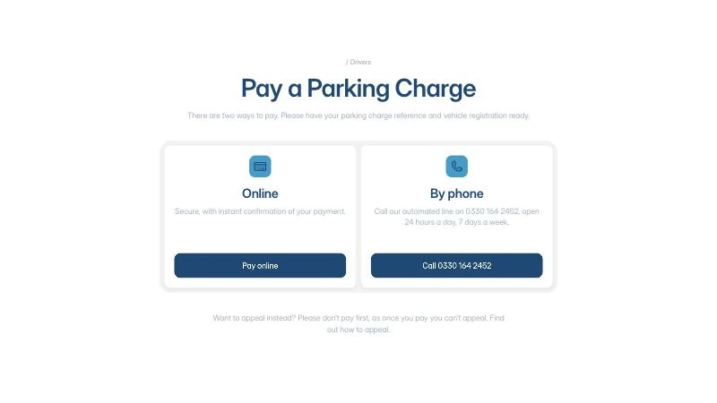
- 01Pay is never more than a click away"Pay a Parking Charge" is the first button in the hero, and it's pinned in the header on every page.
- 02Two ways to payOnline, or the automated phone line, open 24 hours a day, 7 days a week.
- 03No hunting halfway throughThey're told up front to have their charge reference and vehicle registration ready.
- 04Appeal without a fightAppeal sits right next to Pay, with a clear warning not to pay first, because paying ends the right to appeal.
1 clickto pay, from any page
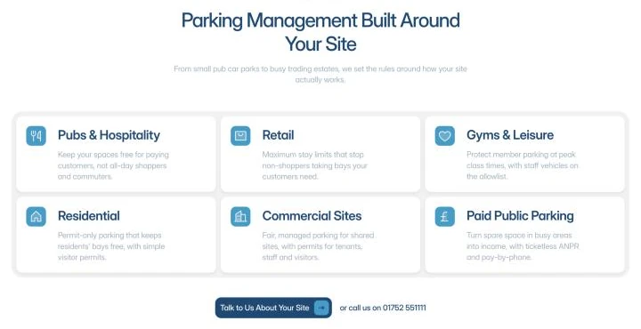
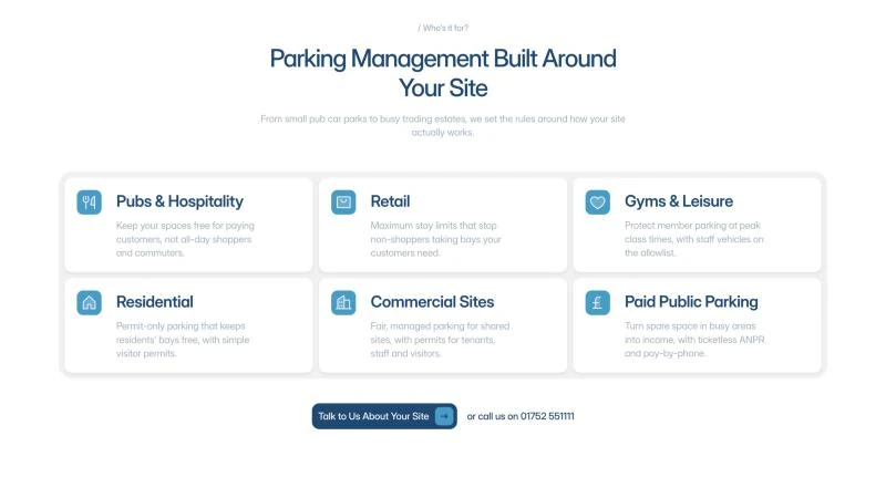
- 01They see their own siteSix site types: pubs, retail, gyms, residential, commercial sites and paid public parking.
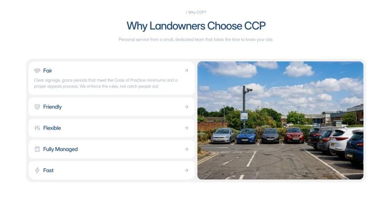
- 02They see why CCPFair, Friendly, Flexible, Fully Managed and Fast, explained in plain English.
- 03They see how it worksSite survey, tailored proposal, installation, then 24/7 monitoring and monthly reporting.
- 04One easy next stepStart the conversation, with a reply within one working day and no cost or commitment.
4 stepsfrom site survey to fully managed
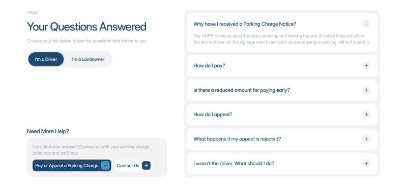
The same thinking runs all the way down the page. Even the FAQs split by who you are: "I'm a Driver" or "I'm a Landowner". Nobody has to wade through questions that aren't theirs.
How it came together
The brand came first, then the website. Never the other way round.
Research
The national operators, the driver experience and what landowners actually need from a parking partner.
Positioning
What makes CCP different, distilled into Fair. Friendly. Flexible.
Brand pack
Strapline, logo, type and colour, so everything after it pulls in the same direction.
Plan
The revenue model, a sprint plan and a launch timeline.
Prototype
A working prototype to test the two-visitor journey before anything was built for real.
Build
The new site built in Framer, replacing the old WordPress site.
George led the strategy and the brand, then worked alongside the designer on the build, so every page kept to the positioning. Direction before speed.
The result
A brand that finally says what City Car Parks stands for, and what we believe is the cleanest website in UK car parking. Calm, clear and built around whoever's on it.
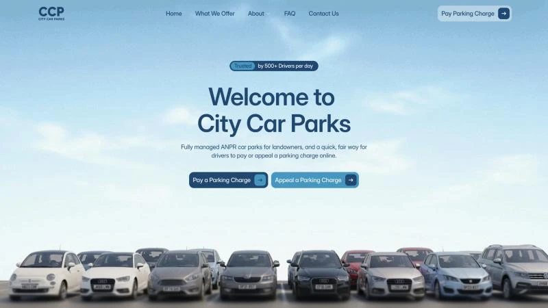
Don't take our word for it. Have a look and judge for yourself.
Let's chat
Ready to roll the dice?
If you aren't willing to make a change, don't expect different results. I like helping founders, creators and anyone who wants to make something happen.
- Prefer not to talk?
- I'll come back to you
- Find us
- Plymouth, UK
- Working UK-wide and beyond
